For the past few weeks we've been working on iBooks for our animation, in explaining our ideas when creating it.
It didn't take up a lot of time as I mostly just copied it off whatever I wrote on the blog but it was a fun, new experience.
Sunday, November 6, 2011
Sunday, October 9, 2011
Creative Media Analysis Task – Year9 2011
Factory from citrusink on Vimeo.
Animation – Factory
This animation, Factory was made by Miwa Matreyek around two years ago, in 2009. Some literal objects that can be seen in the animation are people, factories, buildings, smoke, tools, hands, scientists, airships, blender, machines and computers. These may be literal objects but some are displayed as something else like metaphors. For example, the large hand shown, that repetitively picks up things, can be a representation of machinery which picks up things like a hand does. Machinery is possible representation as machines are usually only given orders to do repetitive work. The first thing noticed when watching this animation was the smoke as the title, factory, lead one to think of pollution as today, being environmental and air pollution are well known to all ages. Afterwards it is recognized that the main focus is not about pollution but repetitive work and work that many have no interest of at all.
The facial expression on the people seems serious and just concentrating in getting the work done, for the sake of getting it done. In addition, the effect of it being black and white makes it even duller. All the shapes and images shown are very realistic, the straight and sharp edges suggests that it was cut out from maybe a magazine and made into something like a collage, stuck down flat but then there was the motion of the objects, which contradicts the notion. Many of the lines are straight bold and thin horizontal in motion that suggests stability and strength but also calming and peaceful as they just continue with their jobs quietly and individually.
It is difficult to tell the time of this animation as it is in black and white but since the beginning shows people entering the factory to start work it would seem like it was in the day as that is when most people start working but it is also possible that some factories start working in the dark at night. Then turning to look at the animation again, the colour of the background and sky shown is white and not black therefore, suggesting that it is in the day and not night.
The overall visual effect of the repetition gives the mood of boring work and the dullness gives the feeling that the people are not enjoying their work at all.
After surveying some people, some friends has suggested that it seemed very repetitive and they random. They are unable to come to a conclusion as to what is going on. Many family members have thought that it was really depressing in its own way and overall many were just confused as to what is going on and therefore, did not have much to say.
The black and white colours give the animation an overall effect of a peaceful, plain and repetitive life. The sounds are just as repetitive as the actions shown, its all mainly the sounds of machinery and metal sounds, tapping and anything that is shown, nothing too random. The sounds just go with what motions are shown which make it more realistic as opposed to it being just the images moving with no sound. The sound complements the motions of the images giving it more of an affect.
This animation gives one the image of how repetitive peoples everyday lives are and how many, despite disliking their job must continue with it as they have no choice, they need to earn money for a living but as children, children have a choice and should cherish it, to think over things carefully and thoroughly before making the choices that will affect their future forever. As they don’t want their lives to be black and white but filled with colours everyday, to be able to put a smile on their faces as they face a new day, to be alive and not be like a dead machine.
Tuesday, September 13, 2011
Assignment, Music Video - Finished
There was some problems in exporting my final project so I don't have it on the blog at the moment but I'm pretty satisfied with what I have handed in though I would have wanted to change some parts and like touch it up a bit if there was more time.
Throughout the process of the project I made many adjustments and changes to what was originally planned but it still displayed the original concept of men going to war and surviving.
The plan for a freezing heart worked out really well but it continued through to scene 2. I had some problems in making the hands look like they were shaking, so I gave up on the idea and went with another plan I had in mind of a lady reading a 'Call of Duty'kind of letter and then crying about it...Then the heart shows up on the background and starts to freeze up.
For scene 3 where the song goes 'you say that your leaving' I just have three motions of the soldier front, side, back showing him turning and leaving. Then the original plan for scene 3 is pushed forward just before the chorus starts.
So far, I beleive the changes made were better than the original plan.
The original plan for scene 4(chorus) was similar for the next scene and I think I didn't plan this scene very clearly, like it wasn't very definite. To tell the truth, after scenes 1,2 and 3 I didn't look at my story board for directions as to what I was going to be doing, so practically everything changed other than the definite plans I had in mind at the beginning of doing this assignment.
During the process of the first few scenes, I began to really want a collision scene for the chorus but was quite hesitant as I wasn't certain whether it would work out or not, like if I would be able to do it. Luckily, I was able to do it and it turned out to be really good, though I did have some problems and it took many attempts to get the movement of each foot right and have the soldier finally running.(more about this can be read in...)
After getting the soldier running I made a copy of it and flipped it so that it seemed like two soldiers colliding in a fight, at first when it was done it looked really odd as it was like two twin sodliers just like running against eachother and since the first few scenes all have a dark background, a sudden white background in the same mood didn't really fit in so I decided to switch the colours.
Unfortunately, not every part of the scene was changable but then I thought it was a pretty good idea to have it flashing black and white instead and so the unfortunate event turned out to be extremely fortunate as it turned out better than I thought.
I didn't really want to draw people suddenly falling as a whole group of soldiers run against eachother as I didn't think I had the time as I wasn't really progressing at a fast pace for all the scenes I want to be done. To show the same thing but in an easier way, it flashes just before the two soldiers collide. The flash here is not clear white like all the other flashes just before the chorus, nstead, the flash is slightly red to show blood, killing, war.
Afterwards there were colour flashes of red, white and black to show collision. White and black, opposites, so the two countries and red was the colour of bloodshed and war. After looking at the colour flashes, it kind of looked too simple and at the same time I wasn't sure if the audience would get the meaning of the flashes. To answer my questions, I went and got some opinions from friends and see if they understood what I was trying to portray and sadly as I feared it didn't really occur to them that it was blood.
After giving it some thought as to what shapes and forms blood can be represented in, I could only think of blotches of blood or just blood streaming down the screen. Blotches of blood was a bit like slow death and didn't really fit in, like it was more of an individuals slow death not really a whole heap of people. I went with the blood streaming down the screen and have the screen slowly be covered in red but I still kept the flashes of red, black and white to show the impact of collision and at the same time kind of make it that from the black background the flashes are mixing the colours around so it turning into a white background didn't seem too out of place.
In scene 5, it was meant to be a soldier lying on the floor and is struggling to stay alive/awake and then we zoom in on the face and he slowly closes his eyes. In the corner a pocket watch/locket appears, time ticks then fades and photos of family and friends show up one after another and during that time the soldier fades into background and the pocket watch/locket enlarges. when thats done the pocket watch/locket fades and the soldier appears again, close up on face and he slowly opens his eyes again. I would have been reallly REALLY happy if I could have done this but I wasnt able to find a reference or image of a side view from the floor of someones face or even better a soldiers face, so it was really difficult to imagine let alone draw it.
So sadly, I had to give up on the idea but the pocket watch/locket idea was kept, instead of a half dead/ nearly dieing soldier I had one that was tired from war and wants to go home and everything, takes out the pocket watch/locket and because he is tired and out of energy he drops it. As it is falling, it keeps turning and each time it comes around it shows a photo, it was meant to show family and friends but it kind of ended up as all being the soldiers so then it became kind of wierd.
Depending on how you interpret it, it could be soldiers brothers or like instead of reflecting what the soldier sees is 'reflects' what the family is looking at back at home ( lady at the beginning)as it is saying,'your face, i see, in every reflection'.
Inserting the photos and keeping the background the same and having the timing right took ages in this one as when the pocket watch turns to the back I have to colour it in but there are gaps everywhere so it took a while, in the end it took too long and I kind of just rushed it so there's some white bits in the whole thing. The photos was originally insterted only in the circle but then it was kind of hard to colour in the other parts to white and the corner of the photos would show up in some points so i ended up covering the whole pocket watch/lockets with the photo which didn't up so bad. Overall I think this scene was a bit rushed as up to this point I only had a few more days left till it was due.
Due to the fact that I was running out of time and luckily, was able to pick out a spot to cut and join it onto another part in the song so that it flowed well, scene 7 was cut off. The chorus after scene 6 was joined to the ending of the last chorus after scene 7. For this chorus instead of flashes of images of soldiers leaving, there are images of soldiers and people surviving the battle then on the last flash the images are repeated quickly one after another as a build up to the flash of the image of a hand reaching towards the light.
Finally, you see traced photos of soldiers coming home, as each tracing shows up it turns from a black background and white tracing to a white background and black tracing to show that they got out of the darkness and are now in the light. On the very last tracing the real photo slowly fades in over the tracing and finishes!
Though there are some parts that I'm not so happy about, I'm just glad that I was able to finish it up to this point as I would've been really disappointed if I wasn't able to make it in time and had to go with the plan of just cutting it off after the blood covereed the screen. Throughout this project, there were times of panic and times when it was annoying that the computer won't do as you want and times when you are sick of doing the same thing over and over again for each little slide/ section/ part, despite all this I had fun, I was able to explore it and experiment with it and I enjoyed this assignment very much as Jo and I shared opinions, tricks and helped eachother out at different points.
For this project, I did use quite a bit of holiday and weekend time to finish it but I didn't really mind since I enjoyed it and always looked forward to watching the whole thing when it's done. This project took longer than I expected but I think if I had like all the details clear as to what I was doing and stopped changing everyting it might've taken less time than it had but usually I'm a person that plans as I go, I can't have every single little thing planned all at once before I start as I wouldn't be able to think of all the ideas and know what I clearly need to do for every little part. Usually, I just have to do it. During the process of this project I aslo found that if you press 's' on animation ish it goes to the next slide and 'a' to go back. I also found that when you insert images into animation-ish you have to do it one at a time you can't just select it all and go 'insert' and I would suggest the person who made animation-ish to change that.
You can't select the same colour that you used last time as it resets everytime you open it again, so if you were in the middle of changing the colour of the object on every slide it's better to have it all done before you save and close it as the next time you open it you would need to find the colour again.
If I were to start the project again, I might have more of it planned but then that would take up a lot of time as I would keep changing my mind. I would probably try and do different scenes at different times though I think that how I just followed the scenes through and added them to the song as I go was a pretty good idea as I would know how long it would have to be and make adjustments before going onto the next scene and knowing what I need to do to the next scene for it to fit with the rest before I started was good.
Maybe try and have a partner next time? That might've taken off some time on my side and we would be able to do more. I wouldn't change my current ideas though, if I were to do this one again as I like it the way it is though for the second half I would change quite a bit of it.
Monday, September 12, 2011
Wednesday, August 31, 2011
Friday, August 26, 2011
watch only 1 min 13 sec
The reason why the blood seemed kind of rushed at the end wasn't because I wanted to go with the song, that was plain coincidence. As I mentioned before, the blood was taking up too much time to do, truthfully I didn't think it would take this long and I was kind of losing my patience and getting sick of it so I ended up just doing it however I thought it would be like without following the rest of the example I found. Luckily, my decision was right and wasn't regrettable when it fit with the song.
Thursday, August 18, 2011
blood cont.
Following the examples were taking too long and my timmmeeee was running out, so I ended up just going with my instincts as to how the rest will be but I didn't get to do much of it after making that decision today.
Wednesday, August 17, 2011
Monday, August 15, 2011
blood beginning & research
reference :
http://www.youtube.com/watch?v=WU63iE338fw&feature=relmfu
To find what wasn't right, I asked a friend to take a look and see if she got the meaning behind the flashes and unfortunately she didn't :( but I need the people who see it to get it so I thought of things that represented blood more, my friend gave the idea of having red blotches of blood dripping onto the screen. I've thought of that but it didn't seem right for a whole lot of people dieing and like its not just one person and its also supposed to show collision? (do you get what I mean?)
So then it was definite that whatever the idea was it had to end up covering the whole screen in blood and then thinking of horror movies came up with the idea of blood dripping down the page and eventually covering it all up but I didin't know how to do that so I went on google and searched up some examples.
Thursday, August 11, 2011
red flash
So that I didn't need to draw the actual part where the soldiers collide I made it flash in the middle before they collided and then these flashes where meant to show collision in place of it but somehow... it doesn't seem right.
Flash intersection first verse and chorus
As I said before about the flash intersections this was the trials for getting the timing right and then you can see the whole thing that I've done so far together.
Sunday, August 7, 2011
Black and White
This idea came up when I thought the white background didn't go with the whole animation I've done so far so I tried to colour the background into black but on some slides I weren't able to do that, and I didn't really want to go through all the trouble of cutting and pasting and erasing stuff again just to change the background black. Then the idea of having it flashing black and white came up, so I just coloured all the ones that were able to be coloured in black in the background and turned the soldiers white and tried to do that so it was like every second slide if not some were every third slide.
Tuesday, August 2, 2011
Monday, August 1, 2011
walking soldier + copy
Okay, so I finished my soldier running, like FINALLY. It took forever to figure out how many different images you needed on just one leg so that it seemed as though it was running and when I thought I got the gist of it I found out that there was too many images of little motion that wasn't needed but when I got it it became a lot easier. I'll have to thank Jo for posing for me for a while and running =.=". To make a flip copy on animation ish of the soldier I drew, I was looking for a flip button but there wasn't any(that got me pretty annoyed). I exported the animation ish into images, flipped it and then inserted it back into animation ish and then GUESS WHAT? At school when trace was turned on and I watched my soldier running, I really liked it so I asked Mr Powell what he thinks and then he showed me how I can flip the soldier on animation ish and I was like (WHAT?! IF I KNEW THAT EARLIER I WOULDN'T HAVE NEEDED TO DO ALL THAT!! like WHYYYY didn't you tell us earlier??)but anyway, so I found a new way to flip drawings around on animation ish.
Walking soldier with shadow/ghost
Tuesday, July 26, 2011
Final Picture flash edit
To do these picture flashes, photoshop is used again. The pictures are inserted into photoshop and after using lens flare you save it. This is done repeatedly but the lens flare gradually gets bigger. I mostly started from either 50% or 100% and gradually increased by either 25% or 50%, usually when you get up to 200% the whole picture would be covered. When all the pictures are saved they are insterted into animation ish and as you can see here these are the results. It's really simple but time consuming and what costed extra time was trying to get the timing right so that it went with the song.
Sunday, July 24, 2011
Wednesday, July 6, 2011
The first verse - 0:11 - 0:38
So I finally finished ONE verse! Its like there's still two chorus and two verses to go!..... Doesn't really make you feel any better but anyway, after finishing this verse it felt really good to see it all come together eventhough its only the first verse.
So here I decided to have the heart in the background, kept the heart beat and everything but to have the heart in the background freezing up. I, once again, turned to photoshop after exporting the scene into images to keep the length of it and then opening it all in photoshop with the images for the freezing heart and started dragging and turning the opacity down and saved all the images again and imported all back into animation ish. Seriously, up to this point I was sick of doing the same thing over and over again but I still managed ;)and this was the result of all that work!
Oh nearly forgot, the next part where it freezes up for like a sec and you miss all the stuff I did for that part. I searched up images of ice and everything, then forged the images together so it doesn't look wierd and finally put it on the layer of the image that was going to be frozen after it was all done and dusted and i inserted it into animation ish i figured i didn't have to do so much for it as you don't really see what I have done.....
The soldier was free hand drawing where I just found images of people from the side view but other than that drawing a soldier from the front and back view was pretty simple, have you noticed? my characters don't have a face! it's because I can't draw one and if I do i figured it ruined it so I left the faces blank, so lets just say... use your imagination!
Monday, July 4, 2011
Beginning with no heart
After playing with this character a lot, I came up with the idea of making her cry because I thought it'll have more impact. Then I had the tears dropping and I thought I could have the tear freeze everything up once it hits the ground or whatever.
Beginning 02
This is the other part of scene 1, here I traced an image of a lady and tried to make it so that it seemed as though her heart beated. I took a while and wasn't going so well, I duno if I'm even doing it right.
All I did was enlarge the image slightly and put a layer on top of the other but as the layers increase it slowly fades.
Sunday, July 3, 2011
Changed Heart
At first changing the background went a bit wierd at the beginning so I fixed it up and now it looks like this!
Saturday, July 2, 2011
Beginning 01
I thought I'd put this in before the heart freezing up, a lady sees the call of duty letter and then turns white to show that she is shocked. The lady was traced but the rest was free hand drawing so it looks a bit wierd, I wasn't able to find a table that was kinda the old type and round. Neither was I able to find an example of a 'Call of Duty' letter.
Changing the Heart
I didn't like the background and it was hard to connect to the next scene, so I imported the images back into photoshop and put a black layer over it except for the ice and the heart. Then saved each image and imported it back into animation ish.
Saturday, June 11, 2011
Wednesday, June 8, 2011
Frozen Heart
Today, I finally finished the heart and can move on to the next part but somehow I'm still pretty dissatisfied with the result as the heart keeps moving and it doesnt look really smooth but since I think that I've spent too much time on it, I'm just going to move on and come back to it when I have time or if I have to.
Thursday, June 2, 2011
Scene 1
For the Heart to look like it is slowly freezing up, I used skills that were taught in term 1 using photoshop. By layering the image of the ice on top of the heart, then putting a mask layer on the ice image. I was able to erase most of the ice leaving the heart showing from the layer below and then slowly safe the image one by one as I cover the heart bit by bit. After each image was saved, I imported every one of them into animation ish but when I was done I noticed that you are unable to see that the heart is frozen in the ice, instead the ice just covers the heart. To fix this there is a part where the heart seeps through the ice so that it is visible and then it continues to freeze the heart.
Thursday, May 19, 2011
Storyboard


For my assignment the animation will be slightly based off the song lyrics. The actual meaning behind the lyrics have nothing to do with the animation but it kind of relates if you twist the words a bit.
The animation is based off war, it shows the pains and suffering, the sad goodbyes and the happy reunions. The song is 'Alive' by Leona Lewis and it shows how soldiers try their best to survive to keep fighting, to see another day and to return home.
Oh and there will be someone drawing in the background throughout the whole thing.
First Scene
Lyrics :
I breathe, I hear
But I don't believe it
My heart, it beats
But inside I'm freezing
Animation:
For this first part, there will be picture of a heart in a black background and it will slowly freeze up and be covered in thick ice.
Second Scene
Lyrics:
My hands shake
They've lost all their feeling
Animation:
Here there will be a pair of soldiers hands in the soldiers point of view you see them shake. This can show fear, someone who has gone a bit mental or just simply that they are cold as it is hard to find warmth in the midst of war.
Third Scene
Lyrics:
Nowhere to take
You say that you're leaving
And there's no turning back this time
Gotta stay alive
Animation:
You see the back of a soldier or the departure of many soldiers on ships/trains and then slowly fades away. Then in a quick flash for the last line, 'Gotta stay alive' you'll see quick flashes of war (the actual fighting part).
e.g.


Fourth scene
Lyrics:
Chorus:
Where do I go when I'm so alone?
Where do I turn when you are so close?
We try not to crash but we still collide
Tears I've cried, I'll survive
I'm alive
Animation:
Soldiers sitting alone, heads down picture/photo turning gray. Then a lockets with family photos turning in midair (360 degrees). Afterwards there will be more flashes of overview war collisions, a man crying and finally, close ups of soldiers fighting in war.
Fifth Scene
Lyrics:
I'm stripped, I'm bare
I'm left here with nothing
I hold the wheel
And know where I'm going
Your face, I see, in every reflection
Animation:
Here you see a man laying who's tired, has no more strength and is injured very badly. It is a close up of his face on the ground and he looks like his about to die. Then there is a pocket watch in the corner and you see his loved one/ones. Afterwards, it zooms in on his face and he slowly closes his eyes.
Sixth scene
Lyrics:
No time, no space
I've lost all direction
And there's no turning back this time
Gotta stay alive
Animation:
The screen is all black for a some time and then it comes back to the man whose eyes are open and struggles to stand up and continue forward.
Chorus Repeated
Seventh scene
Lyrics:
I'm gonna get there someway
Through all the tears that you bring
And any road I can take
Just to get me some place
Where all the stars on my heart
And all the lies in the dark
Disappear in my head
Lights so bright, tonight
Gonna drive them away
Animation:
Here, using animation-ish there will be a person attached to the floor fully black and struggles across the black line (floor/ground)and continues to reach his hands up towards the light on the top left corner every so often. At the very end there is a flash and you see them fighting in war again and then slowly fades.
Eighth Scene
Lyrics:
Chorus & I'm Alive repeated at the end
Animation:
After the whole thing has faded from the previous scene, you see the homecoming of the soldiers from war on some sort of transport. The drawing that was playin in the background is slowly brought forward and you see the soldiers and then they are redrawn on animation-ish and what happens is you see the happy scenes of reunions in animation-ish and finally you see a whole family and then it slowly turns into a real phtoto.
Wednesday, May 4, 2011
Istopmotion
Here, Jo and I went to the junior school playground and played around with istopmotion and sand. What we did was, that we just mosed the sand bit by bit and took a shot of it so that in the end it looks like the sand is piling up on its own. After doing it for a long time, it kind of just got messed up as we got more impatient because it takes a lot of time.
Tuesday, April 19, 2011


Monday, April 18, 2011
Wednesday, April 13, 2011
Tuesday, April 12, 2011
Monday, March 21, 2011
Final Products


Each separate one of these avatars made here give off their own unique feeling. Together, the blue and red flames even eachother out as they are complete opposites, whatever the blue doesn't have the red has and whatever the red doesn't have the does. The two together balances eachother out and therefore makes a perfect pair and changing their colours to purple a colour that makes them look cool but gives them uncertainty and fear towards eachother's trust and constantly needing clarification but that's what love is all about right?
Saturday, March 19, 2011
Avatar in 'Love'


For this one I changed one of the previously researched flames purple and for the background purple background I found one that had a centre point sort of thing towards the right and my avatar couple was towards the right so I thought it was just right to make the avatar couple on the right the centre point.
My first trial didn't really work out when I tried to make it so that the place they are in contact is purple and it gently changes to blue (towards the girl) and red (towards the boy)like their flames were only just starting to change as they are falling in love but it didn't really work out and the couple on this one was too cramped up together.
I found another one and decided to do it all purple so that the fact that they were pruple stood out more. The background idea is the same and the holes oh the male's sleeve is in fact suppose to be holes as the jacket is burning, since they were on fire and the picture I found his sleeve was in the forground, it would have seemed weird if nothing was wrong with it since fabric burns and thought that I could make it seem like it was on fire but it didn't seem to work...
In Addition, I kind of made it a little pinkish purple as I thought it was romance and if it was like dark dark and full on purple it wouldn't have seem as good as having it pinkish purple so that it gave off a little cuteness in the romance as pink is close to red.
If I could have another go at this Avatar couple I'd make the burning clothing seem more realstic and make the two avatars faces (heads) stand out more, although I thought that the couple could be hiding behind the flames of the sleeves as they were just about the kisss, you know, a bit of privacy.^^
Thursday, March 17, 2011
Blue Flame Female


I really like the way I've done the eyes for this one, it really makes them stand out but my hair wasn't done really well so I put the layer of flame for the hair in front of the layer of just blue hair. If I could do it again, I'd make sure to cut out the hair in more detail and make is so that the whole female stands out more from the background.
Blue Flame Research


Here I researched several different blue flames. The flame used for the background had 3 layers of the same flame but flipped and turned. Originally, I wanted a calm, lighter blue flame for the background but I decided that it would make the girl seem too fragile, when I wanted them to look independant like they didn't need a man to rely on and live but needed them for love and what they are missing within themselves, like a thrill in life.
Red Flame Male


Here the first one is an example that the teacher showed. This Avatars hair unfortunately stood out more than the eyes. So, If I could do this again, I'd make sure that the eyes were bigger and brighter and made it so that the male seemed stronger and much more powerful(had more strength).
Wednesday, March 16, 2011
Two Main Originals


These are my two mains. I chose them because I wanted them to not be fragile but a race who are able to survive independantly. I really wanted to make my avatars that the first thing you look at was the eyes and I thought the eyes of these two people stood out and they really had quite the stare/gaze.
Red Flame Research


Here is some research on some red flames and some things peopel did to draw things out of flames, like make them look flamey sort of thing. Here Mr Powell showed me how they did it and that it would've had lots of layers of just lines with different colours, it may look simple but it would've taken ages to do.
Personality Profile
My race of people/ Avatar are unique in their own way. They are made of flames but very human like, they are always burning brightly til the day they die. The male are always the red flame as they are more aggressive compared to females who are usually calm. They have opposite characteristics and flames as there is a saying that opposites attract and so my race of people are that females are opposite to the males but when they come together and fall in love they have the flame of purple because blue and red makes purple, although the colour purple isn't really a romantic colour but it shows that when you fall in love there is uncertainty towards the trust within eachother and fear of losing one another.
Monday, March 14, 2011
Colour Research


I researched some colours and what feelings and what you see in them, like what you would get from a colour and what that colour sort of represents. This helped me with coming up an idea for my avatar...
Angelina Jolie's Head Morphed with another Character
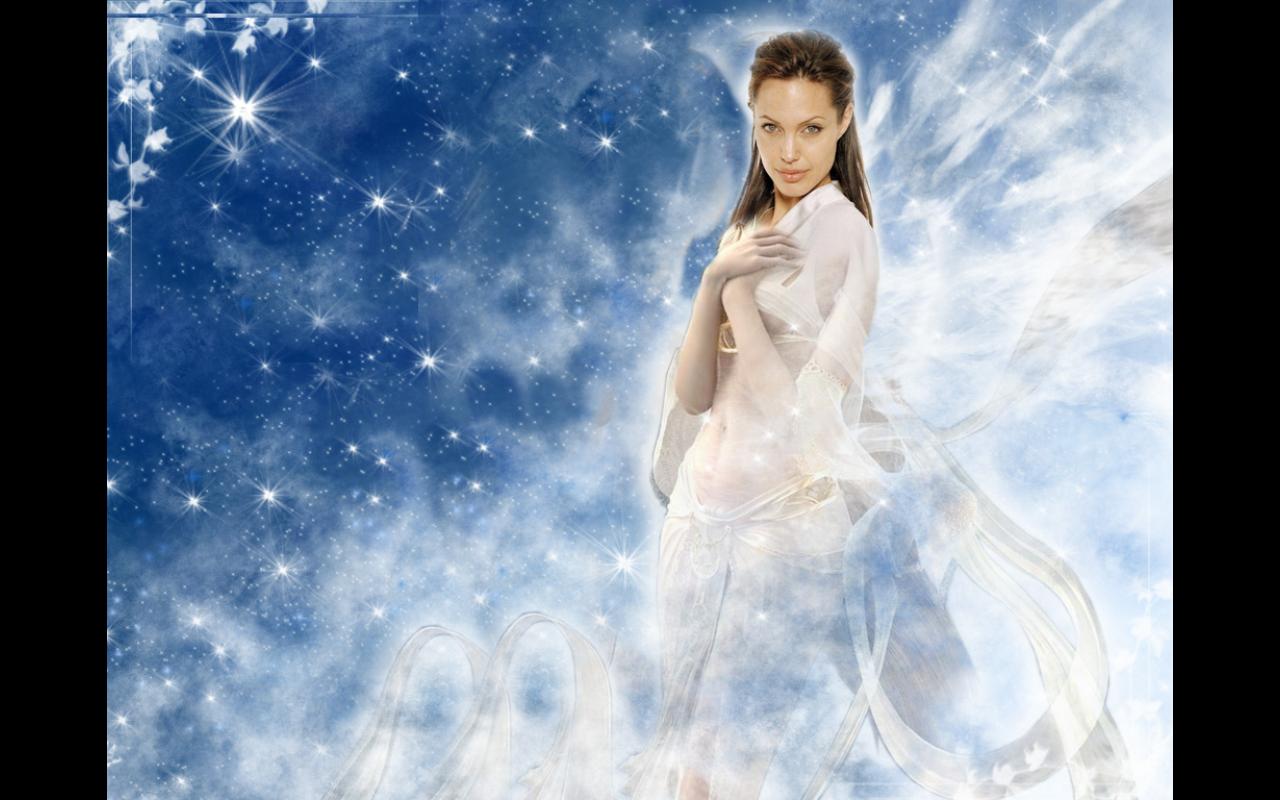
I went back to this one and fixed it up so that the background was cleaned up properly and that you don't see any random lines of the boarder of the separate pictures.
Skin Layering & Morphing a Person


Here I put a skin layer of the sky with the opacity down and some wings where the eyes are. The wings were changed with hue saturation and flipped. Some part of the hair was also done with layers of wings in different positions and directions, masked and using a brush to rub parts out so that it fitted.
Morphing

Here I took a picture of Angelina Jolie in the right position and took the head and placed it on the body of another picture. It wasn't really done well, like i didn't really rub everything out right and you could see bits and pieces but I didn't feel like doing anymore of it afterwards so I left it like this for a while.
Friday, March 11, 2011
Research


I researched for my victims who I would be doing some experiments on and since the clothing I researched clothing that was for girls. I found my female celeberities in some of the positions and had the looks(facial expression)that I wanted.
Subscribe to:
Comments (Atom)